Reflection #1 – October 8th, 2024
I used to think making a website is easy, especially when there are website building platforms like Wix or Squarespace available. However, after starting to build my own website, which includes purchasing and managing my own domain, I realize that there are many details that go into a website.
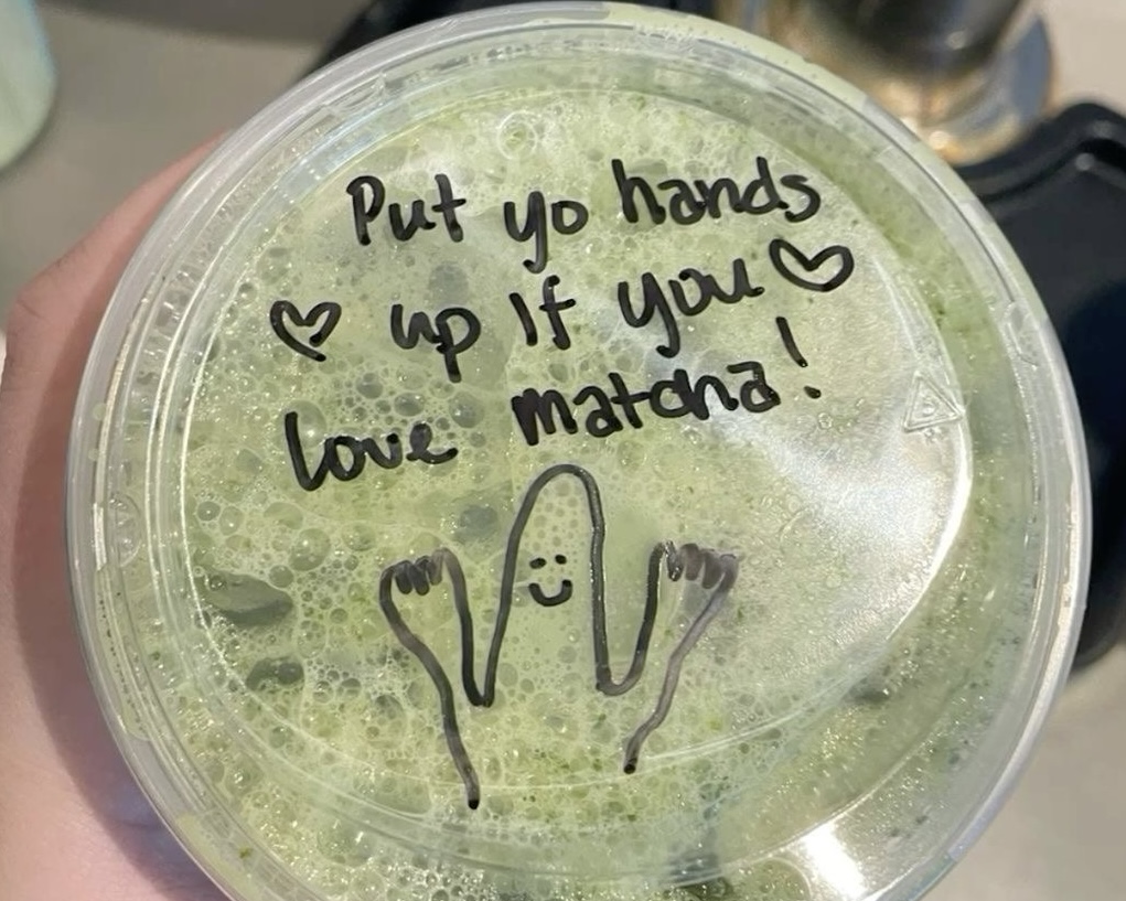
My initial plan for this website is to be user-friendly while looking professional and well-put together. Therefore, for any design aspect, I tried to narrow it down and make it as simple as possible. The homepage is the main hub to access everything and include all the details. On the homepage when you’re scrolling down, you would notice each section is divided and has a different color background. I specifically do this so it is more clear and users can see which information is for which section. The first thing that a user will see is information about the website. For this, I want to keep it straightforward so I included a short description of what our digital publication is about, a slogan for the website and a picture of matcha for the visual aspect. After this the content section will pop up. For now, I only have three sections. Three is a good number for many reasons. It is easier to create quality content when you focus on a smaller amount and so there is less filler content that might drive users away. The last section is about myself and how users can reach me when they have questions. I did not allow comments on my website since I don’t want bots to fill my comment section with spam links. However, the cons of this is users might not know where to contact for further questions. Therefore, I have made it clear to DM me on instagram if there’s any question and I plan to put this reminder after every post on the website so if people skip my about section they can still see it.
With content creation, I had only started on the matcha beginner guide. The guide will have every information on how to start which is the most important so I plan to finish and finalize it within this week. The weekly content will be coffee shop finds, which is a series of coffee shops or matcha bars with the best matcha. For this section, I will include pictures and detailed reviews of the drinks, prices, atmosphere to location. I also have a TikTok specific for FnB reviews so I might attach the video to the website post to draw engagement to the TikTok account. People tend to stay away from posts that have too much reading so I plan to incorporate the video often to make it more entertaining to consume.
Last but not least, I check on the technical problems and users testing/feedback. For the technical aspects, I complete all the security suggestions on the publishing website. I also check in regularly to see if the login attempts went up to the safe limit and update all the software I use so it is always the newest version. With the testing, I access my website through a variety of devices. I try to access through all of my devices like iPad, my phone, and my laptop. Furthermore, I borrow my friends and family’s devices to see how it works. After all the testing, one main point I found the most annoying is I didn’t include the link to the post. For instance, on a website if you click onto something it will jump to the page of that post. I didn’t have it during the first launch and I have to type the section on the search bar to be able to find my posts which I find such a hassle. Therefore, I incorporate the link to the actual title of each section so it will jump right to that page and users will not have to search it up.
For this first launch, everything went smoothly and the website looked exactly like how I imagined. In the coming weeks, I will start to post my weekly content and improve on issues that occured along the way.
