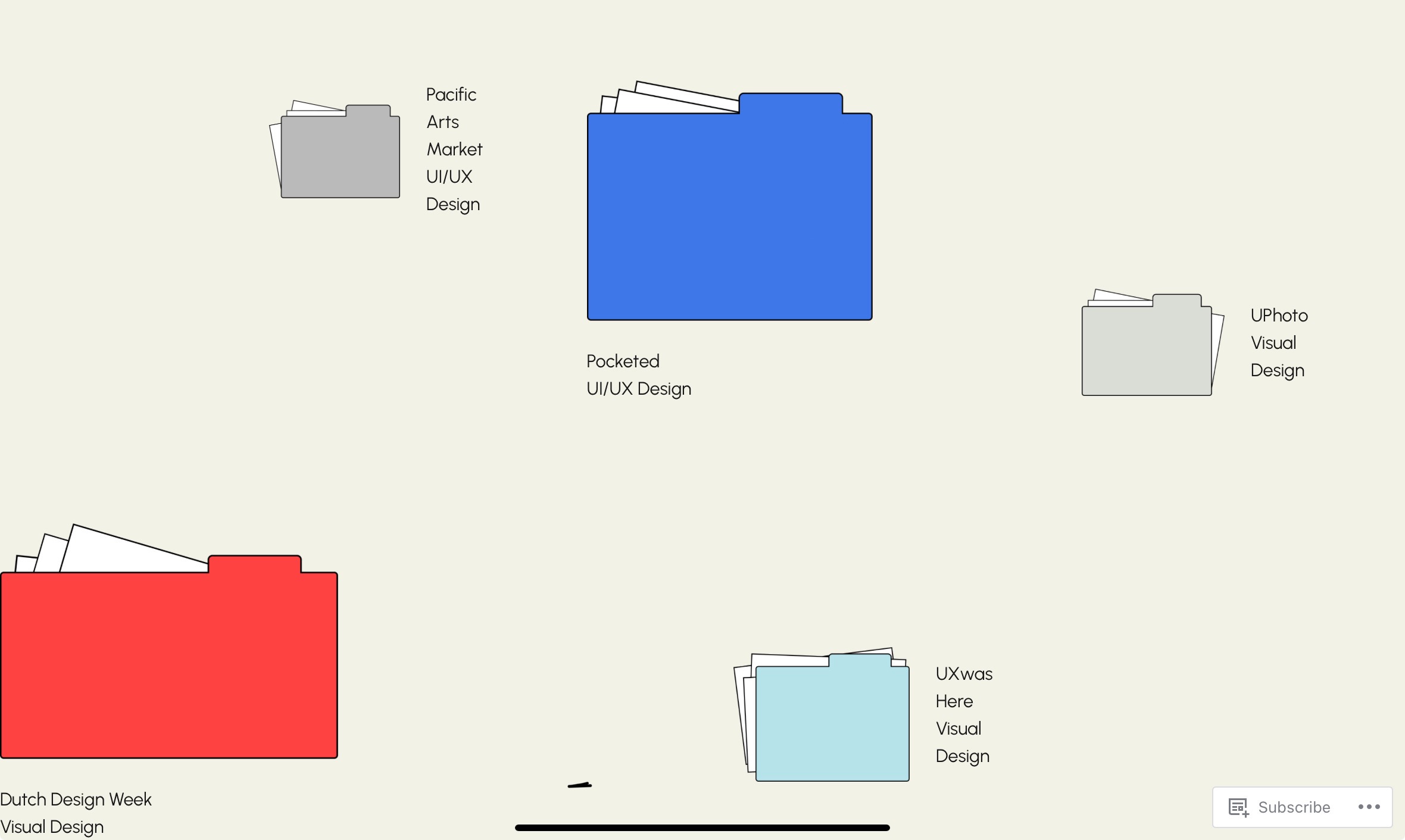
From my perspective, I am impressed with this website. The website looks professional and is easy to navigate with a well-organized layout. The website design is visually appealing, with a cohesive color palette that blends together very well. The color choices are smart – colorful but more on the muted side. With this, the website can still have a pop of color without looking over the top and clashing with each other. The typography is pretty and appears easy to read upon the beige background. However, for those with disabilities, I think the typography can be difficult to read so some improvement can be made for better accessibility. In addition, adding alt texts for images can be beneficial as well. The file pockets as different projects and sections are creative, and fun to look at. Overall, the design and visual appeal strongly reflects your branding as a visual designer.
As for the user experience, it is pleasant and responsive. Once you’re on the main landing page, each section is clearly labeled with its assigned pocket file. The key sections are also easy to find and labeled on the top left. The loading time is fast, and there is no glitching in between transferring different pages. I access the site on two different devices – iPad and my mobile phone – and the experience is slightly a bit different on the two. On the phone, the overall layout of the website makes more sense and flows more coherently. However, as of reading the content, there is quite a bit of space in between the different sections which may look like it’s missing something. In contrast, the main landing page when accessed on iPad does not “flow“ as well as when accessed on phone. On the tablet, it is quite straightforward, which is not a bad thing but the design on the phone makes more sense. Similarly, the content division when accessed on tablet makes more sense with all the spacing in between. In addition, on the main landing page, the red file placed on the last right corner feels a bit too closed and appears to be cut quite a bit on my iPad so I think this could be improved (image insert above).
The content is concise and informative, showcasing your expertise in UI/UX design and visual design. The case studies are well-structured but could be further enhanced with more visuals to break up the text and engage visitors. For instance, the current case study of Pocketed can include more examples of your work so it is more convincing for a potential employer to look at. The written content can elaborate a bit more on what you learn after each work. This can showcase your ability to learn and reflect on previous projects for those interested in working with you.
In conclusion, I think the website is represented nicely and reflects your brand identity as a visual design well. There are minor improvements that need to be made and added, but it is looking really great now. Good job on the current work and I look forward to the final product!